Help:Using the Concentration Anomaly Tool
- Explain time window width setting.
A concentration anomaly is a deviation from the normal. This tool permits the calculation of concentration anomalies.
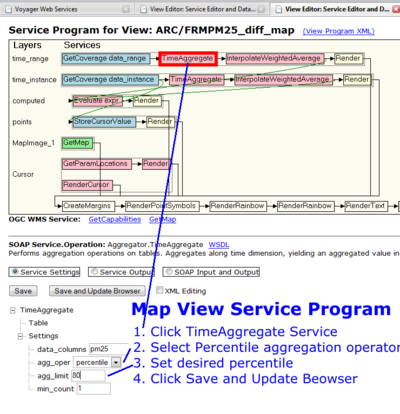
A useful measure of the "normal" concentration is the median value over an extended period of time for a given station. In the tool settings below we have chosen a time setting of +/- 15 days (one month window), which is longer than a typical exceptional event. As seen below in the time series view of a particular site, an aggregation of three years of PM concentration data is used to compare whether a given day's concentration can be considered exceptional. While it is sufficiently short to preserve the seasonal variation of the concentration pattern, the magnitude of the event excess concentration is calculated as the concentration difference between the current daily concentration and the 84th percentile concentration. All of these parameters are customizable to fit a given event's time range. A time window larger or smaller than the one month window used here can be chosen, the data aggregation time range can be extended beyond three years or shortened, and the excess concentration can be defined in several ways, including the difference between the concentration of a day of interest and varying percentiles (i.e. 84) or the median concentrations in the given time window. See Using the PM2.5 Concentration Data Browser to learn how to change these parameters.
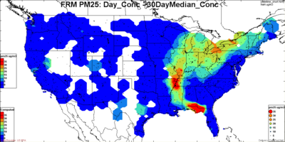
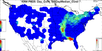
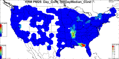
There is also need for flexibility in defining the 'normal' when calculating the deviation above normal. For example in figures below, the excess concentration is plotted based on 'normal' defined as the 50th, 84th (+ sigma) and 95th percentile of the distribution. Clearly, on a given day, the excess above the 95th percentile is much smaller than excess above the 50th percentile.
In the figures below, the concentration patterns are illustrated for two days 2007-05-24 and 2007-05-27. For each day, the leftmost figure shows the measured day average PM2.5 concentration. The circles are color coded using the same coloring scheme as the contour for the concentration field. The middle figure shows the contour field for the 84th percentile PM2.5 concentrations. The color coded circles still represent the concentration for the selected day. The rightmost figure shows the excess concentration of the current day values over the 30-day period compared to the 84th percentile values. While the rightmost figures show that the excess concentrations are high, these by themselves cannot establish whether the origin is from controllable or exceptional sources.
Normal and Exceptional Pattern Analysis Tool
The pattern of air air pollution pattern varies in space, time and also depends on the pollutants. In case of PM, it also depends on the species in the PM chemical mix. The sulfate pattern, for example, is very different from nitrate, organics or dust. An event being exceptional, requires the it deviates from the "normal", but what is normal?


