Difference between revisions of "Evidence for Flagging Exceptional Events"
| Line 149: | Line 149: | ||
On the other hand, if the backtrajectories pass through known anthropogenic emission regions, then those sources are likely responsible. Also if the backtrajectories indicate slow air mass motion in the vicinity of the receptor then atmospheric stagnation may be responsible for the accumulated high values. The Figures below show the backtrajectories to those sights that have PM2.5 concentrations in excess of 35 ug/m3. The backtrajectories to all sites with concentration below 35 ug/m3 were suppressed in order to highlight the transport pattern to the potentially violating sites. | On the other hand, if the backtrajectories pass through known anthropogenic emission regions, then those sources are likely responsible. Also if the backtrajectories indicate slow air mass motion in the vicinity of the receptor then atmospheric stagnation may be responsible for the accumulated high values. The Figures below show the backtrajectories to those sights that have PM2.5 concentrations in excess of 35 ug/m3. The backtrajectories to all sites with concentration below 35 ug/m3 were suppressed in order to highlight the transport pattern to the potentially violating sites. | ||
| − | There are several limitations of the trajectory analyzes presented here | + | There are several limitations of the trajectory analyzes presented here: |
*The backtrajectories used in this analysis were calculated using the ATAD algorithm developed at NOAA ARL. These are derived from the observational wind field of radiosonde network and pre-computed at CIRA as part of the VIEWS operation activity. The ATAD algorithm provides only two-dimensional trajectories by estimating the "characteristic" transport within the boundary layer. Consequently, the ATAD trajectories can not be used to estimate transport that occur during 3-dimensional meteorological situations, e.g. strong subsidence or significant convective lifting above the boundary layer. In several intercomparison studies the ensemble ATAD trajectories were evaluated against the more elaborate HISPLIT trajectory algorithm (BRAVO study). | *The backtrajectories used in this analysis were calculated using the ATAD algorithm developed at NOAA ARL. These are derived from the observational wind field of radiosonde network and pre-computed at CIRA as part of the VIEWS operation activity. The ATAD algorithm provides only two-dimensional trajectories by estimating the "characteristic" transport within the boundary layer. Consequently, the ATAD trajectories can not be used to estimate transport that occur during 3-dimensional meteorological situations, e.g. strong subsidence or significant convective lifting above the boundary layer. In several intercomparison studies the ensemble ATAD trajectories were evaluated against the more elaborate HISPLIT trajectory algorithm (BRAVO study). | ||
Revision as of 09:57, May 28, 2008
< Back to Exceptional Event Workspace
Methodology for Determining Observations Qualified for Exceptional Event (EE) Flagging
Background
The Exceptional Event Rule is an extension of the existing Air Quality Standards. The Rule permits States to flag air quality data caused by exceptional air pollution, such as forest fires and dust storms. These flags are then considered in establishing the compliance of a given site with the National Air Quality Standards. The Rule also requires that for every flagged observation, the States quantify the contribution of the exceptional event. Based on the State’s evidence, EPA decides if the EE flag is justified.
Flagging procedure has to be in accordance with section 40 CFR 50.14 (c)(3)(iii) of the EE rule. Preparing and evaluating the evidence for flagged data is a technically challenging task both for the State and the Regulatory offices. It requires:
- Access to a diverse array of data sources illustrating various aspects of the exceptional event
- Integration of the heterogeneous data sources, frequently incomplete and incompatible
- Demanding data analysis and to establish "clear causal relationship" between the EE and the exceedance
- Finally, the Rule requires a demonstration that the exceedance would not have occurred but for the presence of the EE.
The above requirements place high demand on the resources and skills of the analysts at the State, Region and Federal level. Many State and Regional AQ management offices lack the means for detecting, flagging and documenting exceptional events. Furthermore, the EE Rule is intentionally vague on the types of evidence and analyzes. As a consequence, the submissions are highly variable; some are very detailed and technical while others are brief and descriptive, which makes evaluation difficult and uneven.
The primary purpose of this section is to provide illustrative examples for analysis methods and EE documentation. The illustrations apply a step-by-step approach to assess the events and to provide the required documentation. Furthermore, in order to help the State, Regional and Federal data analysts in these tasks, an array of tools and analysis methods were developed. The examples used in this section demonstrate the tools and methodologies for justifying the EE flags.
Methodology for documenting Exceptional Event flags
Methodology for Documenting EE Flags Screencast ~9:30min | Methodology Script and PPT
The illustrative method of arriving at and justifying exceptional event flags consists of a five-step process:
- In the first step it is established whether a site is in potential violation of the PM2.5 standard; is the concentration > 35 ug/m3? Only samples that are in non-compliance are qualified for EE status flag.
- Next, qualitative or quantitative evidence is gathered and presented showing that the event could have been caused by a source that is not reasonably controllable or preventable
- The third, main analysis step, provides key quantitative information for demonstrating a clear causal relationship between the measured exceedance value and the exceptional event.
- Next, the sample is evaluated whether the measured high value is in excess of the normal, historical values. If not, the sample is not exceptional.
- Finally, the contribution of the exceptional source to the sample is compared to 'normal' anthropogenic sources. Only samples where the exceedances occur but for the contribution of the exceptional source qualify for EE flag.
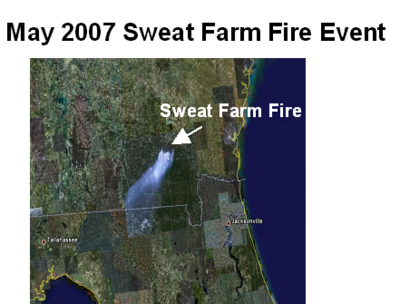
In the following analysis, we will use the May 2007 Georgia Swamp Fire to illustrate the impact of an exceptional event on the PM2.5 concentration over the eastern U.S. The smoke from this event has impacted multi-state regions, which are also receptors of major anthropogenic sulfate sources. Hence it is a suitable event for demonstrating the key "but for" condition of the EE Rule. The illustrative analysis will focus on May 24, and 27, 2007.
The images below are generated by web-based tools as part of the Federated Data System, DataFed]. Adjacent to each image is a link to the tool used with settings corresponding to those used in the image. This allows the users to use these tools for the exploration of exceptional events that occur on other days. A particularly applicable tool developed specifically for EE analysis is the Analyst's Console. It is a single-page browser the brings together all the data views used in the EE analysis illustrated here. These tools are still under (perpetual) development. Also, the use-documentation is marginal.
Step 1: Is there a likely exceedance?
The first step is to establish that a sample is a likely contributor to noncompliance. A site is in noncompliance if the 98 percentile of the PM2.5 concentration over a three year period is over 35 ug/m3. However, a sample may be in compliance even if the PM2.5 concentration is > 35ug/m3, provided that such values occur less than 2 percent of the time.
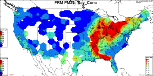
Screening for Potential PM2.5 Exceedances: The PM2.5 samples that are potential contributors to non-compliance can be determined visually and qualitatively by the PM2.5 Data Browser Tool. The data browser tool has a map view and a time series view. The map view shows the PM2.5 concentration as colored circles for each station for a specific date. The time view shows the concentration time series for a selected site. The selection of time for the map view can be accomplished by entering the desired date in the date box or clicking the date in the time view. The selection of the station for the time series is accomplished either by choosing from the station list box or clicking on the station in the map view. The coloring of the PM2.5 concentration values (circles) is adjusted such that the concentrations above 35ug/m3 are shown in red. This provides an easy and obvious (maybe not for Neil) way to identify the candidate samples for noncompliance.
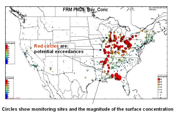
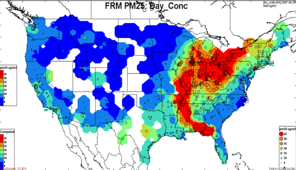
Here, the same monitoring data for May 24, 2007 are presented as contour maps of daily average PM2.5 mass concentration. On this day, a large swath of the eastern U.S. had PM2.5 concentration above 35ug/m3. However, the PM2.5 mass measurements do not reveal whether these potential exceedances were due to known controllable emissions or due to exceptional causes.
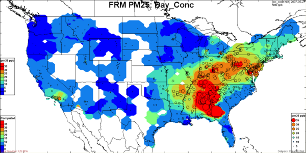
Observation: The images represent the FRM PM mass concentration based on daily average filter samples for May 24 and 27, 2007. A large swath of the eastern U.S. had PM2.5 concentration above 35ug/m3. The FRM PM2.5 daily average filter sample concentrations (top figure) and Airnow Continuous Monitor PM Concentration (bottom) shows a somewhat different spatial pattern. The PM2.5 mass measurements do not reveal whether these potential exceedances were due to known controllable emissions or due to exceptional causes.
Browser for: Airnow PM2.5
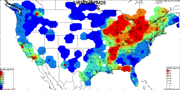
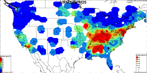
Observation: The top image represents the FRM PM mass concentration based on daily average filter samples. The bottom image shows the corresponding Airnow PM2.5 concentration as a snapshot of the hourly data at 18:00:00 UTC (12 PM Eastern Time).
Step 2: Not Reasonably Controllable or Preventable
In the next step, one needs to establish that there is a potential pollutant source which is not controllable or preventable, such as forest fires, dust storms, or pollution from other, extrajurisdictional regions.
The EE Rule identifes different categories of uncontrollable events:
- Exceedances Due to Transported Pollution (Transported African, Asian Dust; Smoke from Mexican fires; Smoke & Dust from Mining, Agricultural Emissions)
- Natural Events (Nat. Disasters.; High Wind Events; Wildland Fires; Stratospheric Ozone; Prescribed Fires)
- Chemical Spills and Industrial Accidents; Structural Fires; Terrorist Attack
Screening for Causes: Satellite images and satellite-derived aerosol products are useful for the identification of exceptional events such as biomass burning and forest and agricultural fires, wind-blown dust events. Both the satellite images as well as the numeric data products are generally available in near-realtime. A limitation of the satellite data is that they are semi-quantitative, particularly for estimating surface concentrations. Furthermore, satellite observations of surface-based aerosols are only available during cloud-free conditions.
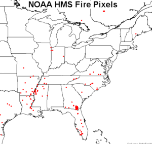
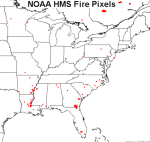
| May 24, 2007 Browser for: HMS Fire Pixels | May 27, 2007Browser for: HMS Fire Pixels |
|
|
The fire pixels, obtained from satellite and other observations, provide the most direct evidence for the existence and location of major fires. In the above map of fire pixels, the cluster of fires in southern Georgia is evident.
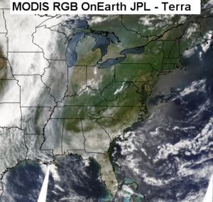
| May 24, 2007 Browser for: MODIS OnEarth Terra and Aqua | May 24, 2007 Browser for: MODIS OnEarth Terra and Aqua |
 |
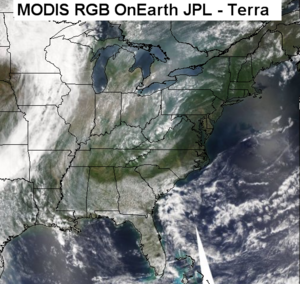 |
The true color MODIS images from Terra (11am) and Aqua (1pm) show a rich texture of clouds, smoke/haze and land. The clouds over Georgia are clearly evident. Inspection of the images shows evidence of smoke/haze along the Mississippi River as well as over the Great Lakes.
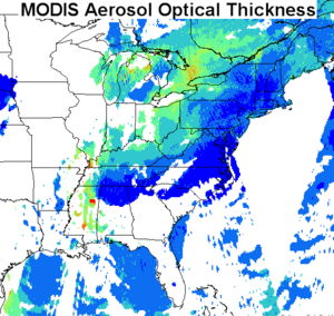
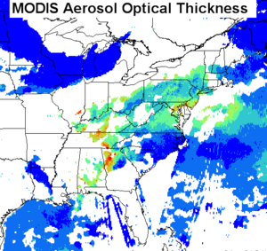
| May 24, 2007 Browser for: MODIS AOT | May 27, 2007 Browser for: MODIS AOT |
|
|
The Aerosol Optical Thickness (AOT), derived from MODIS Sensors (Terra and Aqua satellites), shows a data void over Georgia due to clouds.
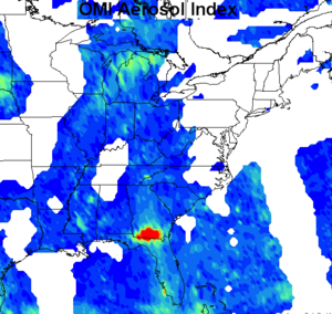
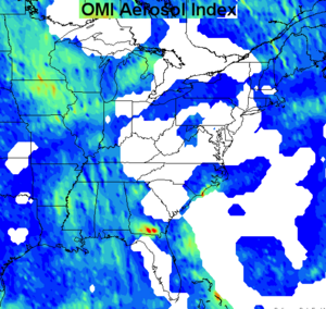
| May 24, 2007 Browser for: OMI AI | May 27, 2007 Browser for: OMI AI |
|
|
The Absorbing Aerosol Index provided by the OMI satellite shows intense smoke in the immediate vicinity of the fire pixels. The lack of OMI smoke signal further away from the fires indicates an absence of smoke. However, it is also possible that the smoke is below the cloud layer and therefore not visible from the satellite. Also, the OMI smoke signal is most sensitive to elevated smoke layers, while near-surface smoke is barely detected.
| May 24, 2007 Browser for: OMI NO2 | May 27, 2007 Browser for: OMI NO2 |
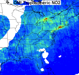
|
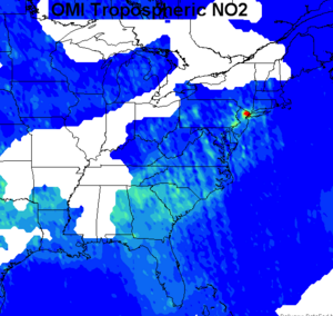
|
On this day, 2007-05-24, the Tropospheric NO2 column concentration, derived from the OMI sensor, shows only a faint indication of the Georgia fire smoke. Here again, the obstruction by the clouds may be partly responsible for the lack of NO2 signal. Alternatively, the wet, low temperature smoldering fire in Georgia may not produce much NO2.
Auxiliary Observations
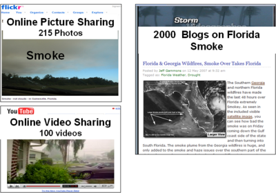
In many areas quantitative observations of PM2.5 are available through additional monitoring networks. In some areas there are also local monitoring stations that can augment the large-scale observations. Sun photometers, measuring the vertical aerosol optical thickness, fall in this category. The general public provides additional qualitative observations of exceptional events shared through internet-accessible blog posts, photos through Flickr and videos through YouTube.
Exceptional events are inherently noticeable because of the intensity of the short-time emissions and due to the unusual impacts they have on the atmospheric environment. The recent proliferation of continuously recording webcams, individual digital photographs and home videos as well as personal blog reports now constitute a significant new information source. Most of these observations are almost immediately placed on the internet, shared into internet-based repositories like YouTube for videos, Flickr for images and blogs for personal accounts. Given the high density and short response of these sensors to the exceptional events it is said that the Earth, has now acquired a "skin" for the detection of changes in the environment.
Automatic Harvesting of Florida Smoke-relavent Resources:
- Google Blog Search: Florida + Smoke
- Flickr: Florida+Smoke
Additional Human Filtering of Automatically Harvested Resources: By scanning the harvested resources (blogs and videos) deamed relevant to event analysis were tagged in del.icio.us. This added an additional human selection beyond automatic harvesting.
- Del.icio.us: 070508+Florida+Smoke
- Del.icio.us: 070508+Florida+Smoke+video
Observation: The satellite based fire pixels show the location of the southern Georgia fire. The satellite-based optical thickness values indicate the presence of substantial amount of emitted smoke. These provide evidence that there is a potential source for exceptional aerosol events due to biomass smoke. Auxiliary and qualitative observations can provide additional evidence and confirmation for the occurrence of exceptional events.
Step 3: Clear Causal Relationship between the Data and the Event
In the third step, a clear causal relationship between the exceedance at a given site and the source of the exceptional event is quantified.
There are multiple lines of evidence that can support the relationship between observations and the exceptional event. These include (1) backtrajectory analysis to establish whether the air masses associated with the exceedance pass through the source region of the exceptional source. (2) Speciated aerosol monitoring data can be used to indicate unusual exceptional status based on unusual chemical composition, e.g. organics or smoke, and soil components for wind-blown dust. (3) Forward model simulations can also indicate a causal relationship. (4) Temporal signatures (spikes) may also yield additional evidence.
None of the methods providing evidence for causal relationship can provide 100 percent proof. However, the combination of evidence from multiple independent perspectives can provide sufficient weight for decision making. Hence, the purpose of this section is to illustrate the multiple lines of evidence and how to combine these for making an argument.
Trajectory Analysis
Background: One line of evidence for causal relationship is combining the observed source of an exceptional event with backtrajectories of high concentration events. In the figures below, we show the color coded concentration samples along with the backtrajectories which show the air mass transport pathway. Backtrajectory analysis can be used to establish whether the air masses associated with the exceedance pass through the source region of the exceptional source. One approach is combining the observed source of an exceptional event with backtrajectories of high concentration events. In the figures below, we show the color coded concentration samples along with the backtrajectories which show the air mass transport pathway. Given the availability of FRM PM2.5 concentrations, it is instructive to examine the backtrajectories (air mass histories) associated with above-standard concentrations. If those backtrajectories pass through areas of known exceptional sources (forest fires, dust storms), then the corresponding high concentrations may be attributed to that event.
On the other hand, if the backtrajectories pass through known anthropogenic emission regions, then those sources are likely responsible. Also if the backtrajectories indicate slow air mass motion in the vicinity of the receptor then atmospheric stagnation may be responsible for the accumulated high values. The Figures below show the backtrajectories to those sights that have PM2.5 concentrations in excess of 35 ug/m3. The backtrajectories to all sites with concentration below 35 ug/m3 were suppressed in order to highlight the transport pattern to the potentially violating sites.
There are several limitations of the trajectory analyzes presented here:
- The backtrajectories used in this analysis were calculated using the ATAD algorithm developed at NOAA ARL. These are derived from the observational wind field of radiosonde network and pre-computed at CIRA as part of the VIEWS operation activity. The ATAD algorithm provides only two-dimensional trajectories by estimating the "characteristic" transport within the boundary layer. Consequently, the ATAD trajectories can not be used to estimate transport that occur during 3-dimensional meteorological situations, e.g. strong subsidence or significant convective lifting above the boundary layer. In several intercomparison studies the ensemble ATAD trajectories were evaluated against the more elaborate HISPLIT trajectory algorithm (BRAVO study).
- The pre-computed backtrajectories used in this analysis are only available for IMPROVE and STN sites. Since there are much more FRM PM2.5 sites, many monitoring stations do not have backtrajectories. As a result, there are sites with red circles (>35 ug/m3) without backtrajectories for airmass transport analysis.
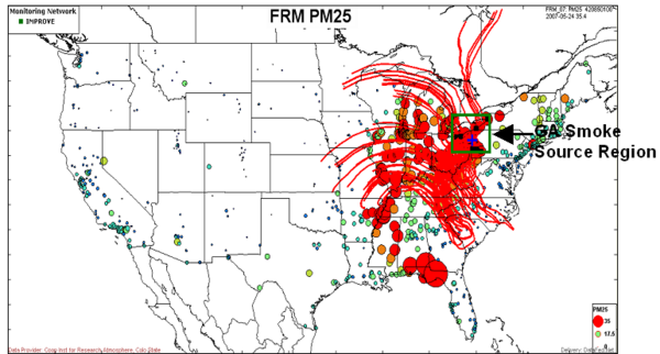
The images below show the concentration of FRM PM2.5 as circles at each of the monitoring sites that report data on a given day. The magnitude of the circles' diameter is proportional to the concentration. The concentration is also color coded for the interior of the circles: blue represents the lower end of the concentration scale, while red indicates the higher end. By setting the scale maximum to 35 ug/m3, the red circles represent samples that may potentially be in non-compliance of the daily PM2.5 standard.
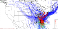
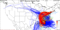
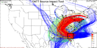
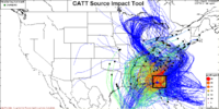
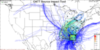
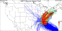
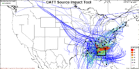
Analysis Approach: In the analysis below the pattern of PM2.5 concentration is displayed to identify the monitoring sites that exhibit concentrations above 35ug/m3 (red). In the next steps, two different trajectory analyzes are applied to delineate which of the monitoring sites are likely to be impacted by the smoke. In the primary trajectory analysis the location of the smoke source area is delineated by the black rectangle, centered on the Okefenokee fire location. All the backtrajectories that pass through that "source rectangle" are made visible while the other trajectories are suppressed. The coloration of individual trajectories prior to entering the source rectangle is set to thin blue lines. During and after the passage through the source rectangle, the trajectory line thickness and color is changed according to the concentration at the receptor site. By following the trajectories leaving the source rectangle, it is possible to delineate the regions of potential smoke impacts. That region can potentially be satisfying the "but for" condition. The monitoring sites whose back trajectories do not pass through the source region do not qualify for the "but for" condition. Standard back trajectory analysis can be applied to ascertain that the air mass is a way from the fire zone.
Trajectory Analysis Tool: The trajectory analyses can be performed by the application of the Combined Aerosol Trajectory Tool (CATT). In the analysis below, the CATT tool is applied to filter trajectories by geographic rectangles. For detailes, see Using the Trajectory Filter Tool
Analysis of May 24, 2007
Browser for: CATT FRM PM2.5 2007-05-24
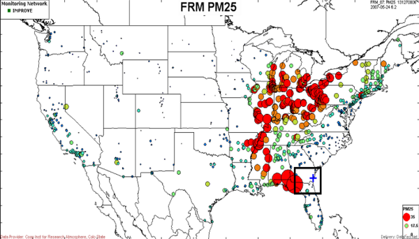
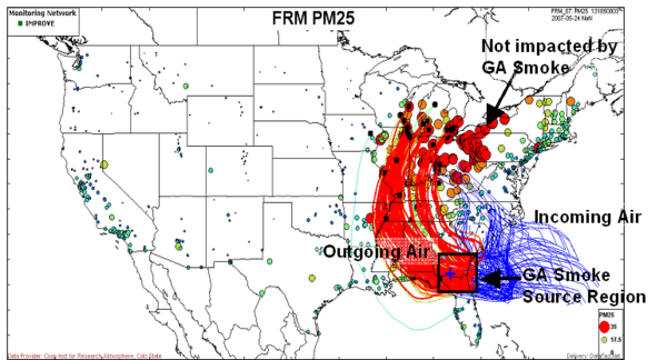
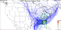
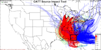
This figure shows the airmass trajectories that pass through the smoke emission region, highlighted by the black rectangle. These trajectories show a clockwise circular flow from the Atlantic through Georgia toward Illinois. According to these trajectories, the receptor sites along the smoke pathway are located in Georgia, Alabama, Tennessee as well as western Wisconsin, Illinois, Indiana and Michigan. Evidently, receptor sites in eastern Ohio and Pennsylvania are not affected by the Georgia smoke on this day.
In order to explore the origin of air masses to western Pennsylvania and neighboring Ohio the backtrajectories for those receptor sites are plotted. Evidently, the cause of the high PM concentrations is the slow movement of air over the high sulfur emission regions.
The backtrajectories for all sites show a clockwise, anti-cyclonic circulation that brings marine air from the Gulf and Atlantic into the eastern U.S. The western bundle of trajectories, which result in high concentrations at receptor sites from Georgia through Illinois/Minnesota? are all passing through the Georgia fire region. These trajectories provide evidence that the smoke has impacted eastern U.S. sites that stretch all the way up to Minnesota/Illinois. On the other hand, the backtrajectories for the air masses reaching the Ohio River Valley are passing to the mid-Atlantic states, well north of the Georgia fire. Therefore, those sites in the Ohio River Valley are not likely to be influenced by the smoke.
Backtrajectories to exceedance receptor sites in eastern Ohio and Pennsylvania indicate slow air movement over high sulfur emission region, without passing through the GA smoke emission region. Evidently, the source of the Ohio-Pennsylvania exceedances is the high sulfur emission region and not the GA Smoke.
Analysis of May 27, 2007
Browser for: CATT FRM PM2.5 2007-05-27
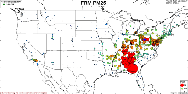
On May 27, the high concentration sites stretched from Georgia through Alabama and Tennessee. Over this region, the sulfur emission density is moderate.
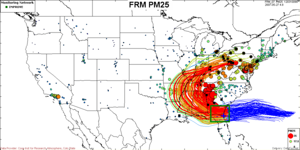
This figure shows the airmass trajectories that pass through the smoke emission region, highlighted by the black rectangle. These trajectories also show a clockwise circular flow from the Atlantic through Georgia toward Kentucky. According to these trajectories, the receptor sites along the smoke pathway are located in Georgia, Alabama, Tennessee as well as all the way to Pittsburgh, PA.
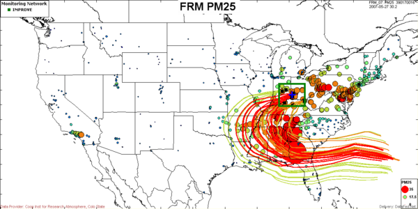
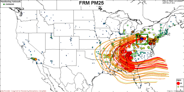
The above two maps show the backtrajectories for the stations in two rectangular regions centered on Indiana-Ohio and Pittsburgh. For both receptor regions some backtrajectories pass through the smoke emission region therefore, it is conceivable that the exceedances within those regions satisfy the "but for" condition.
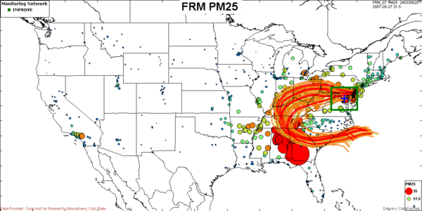
The above map shows the backtrajectories for the stations in a rectangular region centered on Washington D.C. It is evident that the sharply curved clockwise backtrajectories to Washington D.C. do not pass through the smoke emission region and would not qualify for an EE flag.
On May 27, virtually all the high concentrations were recorded just downstream of the Georgia fires. In fact, there was uniform flow of air transported from the Atlantic through Georgia toward Alabama and therefore the high concentrations could not have been caused by the long-term accumulation of anthropogenic sources.
Aerosol Chemical Data:
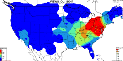
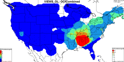
A compelling line of evidence for establishing a causal relationship is through the chemical fingerprints of aerosol samples. This speciated aerosol monitoring data can be used to indicate unusual exceptional status based on unusual chemical composition, e.g. organics for smoke and sulfates for non-exceptional sources. Speciated aerosol monitoring data can be used to indicate unusual exceptional status based on unusual chemical composition, e.g. organics or smoke, and soil components for wind-blown dust. Speciated aerosol composition data provide a strong evidence for the impact of smoke on ambient concentrations. The figures below show the chemical composition data for sulfate and organics, respectively for May 24 and May 27.
Browser for: VIEWS May 24
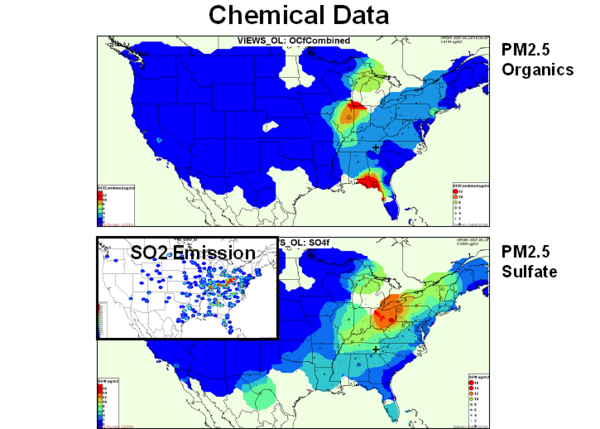
On May 24, the highest sulfate concentration was recorded just north of the Ohio River Valley. On the other hand, the highest organic carbon concentration is measured along the stretch from Georgia/Alabama to Wisconsin. This spatial separation of sulfate and organics indicates different source regions. Based on the combined chemical data and backtrajectories it is evident that the high PM concentrations that are observed along the western edge of the red trajectory path is due to the impact of the Georgia smoke. On the other hand the high PM2.5 concentrations just north of the Ohio River Valley are primarily due to known, controllable sulfate sources.
On May 27, the displacement of the sulfate and organics over the Eastern Uses is even more evident. The sulfates peak over the Virginia/Ohio/Pennsylvania, while the high concentration patch of organics is located over the southern states, Georgia/Alabama.
Model Simulations:
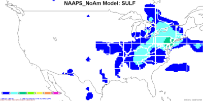
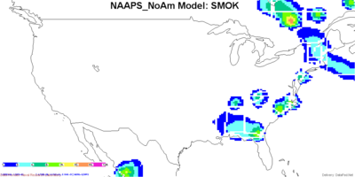
Model simulations and forecasts may also provide evidence for exceptional events. For example, the ability of regional and global-scale models for forecasting wind-blown dust events is continuously improving. This is evidenced by the good performance of the Naval Research Laboratory NAAPS global dust model. The simulation and forecasting of major smoke events is much more difficult due to the unpredictable geographic-time-height-dependence of the biomass smoke emissions. Hence, currently reliable and tested smoke forecast models do not exist. Nevertheless, some of the model simulations provide useful additional evidence for the cause of the high PM levels.
Browser for: NAAPS NoAm, May 24, 2007
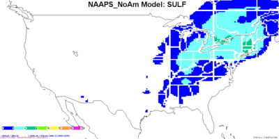
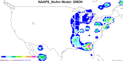
On May 24, the NRL NAAPS Global Aerosol Model shows that the sulfate concentrations are highest over the Northeast. The simulated smoke concentrations are are highest over GA fire region and the plume stretches over toward Illinois in an arc. Both the NRL model sulfate and smoke concentration pattern are qualitatively similar to the observed sulfate and organics.
On May 27, the NRL NAAPS Global Aerosol Model again shows highest sulfate concentrations over the Northeast. There is also a simulated smoke concentrations patch over the GA fires as well as in S. Ontario in Canada.
Step 4: The Event is in Excess of the "Normal" Values
The pattern of air air pollution pattern varies in space, time and also depends on the pollutants. In case of PM, it also depends on the species in the PM chemical mix. The sulfate pattern, for example, is very different from nitrate, organics or dust. THus, the metrics that meaningfully describes the pattern requires many parameters including space, time composition along with those from parametric and/or nonparametric statistics.
For the samples flagged as exceptional, one has to demonstrate that the concentrations are well above the normal. What is normal? How do you measure it? How do you determine/measure deviation from normal?
Spatial Normals
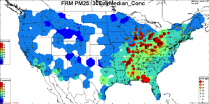
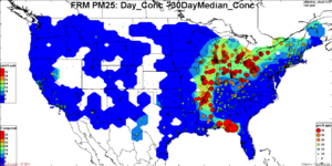
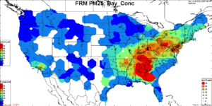
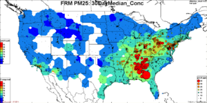
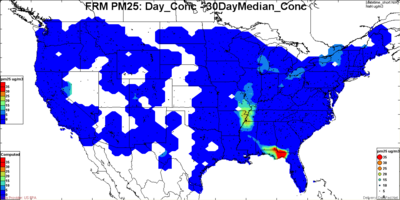
A useful measure of the "normal" concentration is the median value over an extended period of time for a given station. In the tool settings below we have chosen a time setting of +/- 15 days (one month window), which is longer than a typical exceptional event while it is sufficiently short to preserve the seasonal variation of the concentration pattern. The magnitude of the event excess concentration is calculated as the concentration difference between the current daily concentration and the 30-day median concentration.
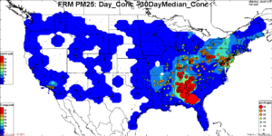
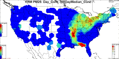
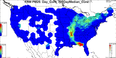
In the figures below, the concentration pattern are illustrated for two days 2007-05-24 and 2007-05-27. For each day the left most figure shows the measured day average PM2.5 concentration. The circles are color coded using the same coloring scheme as the contour for the concentration field. The middle figure shows the contour field for the 30-day median PM2.5 concentration. The color coded circles still represent the concentration for the selected day. The right most figure shows the excess concentration of the current day values over the 30-day median (both as contours and circles). While the right most figures show that the excess concentrations are high, these by themselves cannot establish whether the origin is from controllable or exceptional sources.
May 24, 2007
Browser for: FRMPM25_Day |
Browser for: FRMPM25_30DayMedian |
Browser for: FRMPM25_diff
The FRM shows that on May 24, the high excess concentrations over the median were confined to a well-defined plume and north of the Ohio River Valley. The deep blue areas adjacent to the PM plume indicate that large portions of the eastern U.S. were near or below their median values.
While the excess concentrations are high, these by themselves cannot establish whether the origin of the excess is from controllable or exceptional sources.
May 27, 2007
Browser for: FRMPM25_Day |
Browser for: FRMPM25_30DayMedian |
Browser for: FRMPM25_diff
Observations: The FRM shows that on May 24, large swath of the eastern U.S. was covered with PM2.5 concentration well in excess 35ug/m3. The 30-day median concentration window, centered at May 24, shows that the highest median values were about 20ug/m3 stretching along the Ohio River Valley. The third figure, to the right, shows that the high excess concentrations over the median were confined to a well-defined plume that is narrow in the south and wider to the north. The deep blue areas adjacent to the PM plume indicate that large portions of the eastern U.S. were near the median values.
On May 27, the highest PM concentrations are shown as an arch, stretching northward from Georgia/Alabama toward the Ohio River Valley. The 30-day median values are virtually identical to those on May 24. The excess PM concentration to the left highlights the exceptionally high values over Georgia/Alabama in the vicinity of the Georgia smoke source. On the other hand, the excess concentrations over the Ohio River Valley are minimal. This provides evidence that on this day the Georgia smoke had significant impact in Georgia/Alabama. This is also confirmed by the backtrajectories shown in the section above.
Temporal Normals
Placeholder...
Step 5: The Exceedance or Violation would not Occur, But For the Exceptional Event
According to the EE Rule, observations can be EE-flagged if the violation is caused by the exceptional event. Considering the subtleties of the EE Rule, below are graphical illustrations of the Exceptional Events criteria.
- The leftmost figure shows a case when the 'exceptional' concentration raises the level above the standard. A valid EE to be flagged.
- In the next case, the concentration from controllable sources is sufficient to cause the exceedance. This is not a 'but for' case and should not be flagged.
- In the third case, there is no exceedance. Hence, there is no justification for an EE flag.
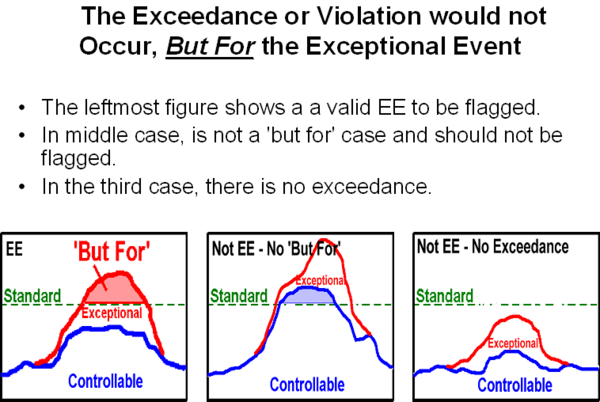
Finally, the contribution of the exceptional source to the sample is compared to 'normal' anthropogenic sources. Only samples where the exceedances occur but for the contribution of the exceptional source qualify for EE flag.
http://wiki.esipfed.org/index.php/Image:EE_ButForSchematics.png
http://wiki.esipfed.org/index.php/Image:Image-EE_NoButFor1Schematics.png
http://wiki.esipfed.org/index.php/Image:Image-EE_NoButFor2Schematics.png
Based on the above analysis, it is now possible to delineate the regions of the Eastern Us ove which the potential exceedances occurred but for the presence the Georgia Smoke which caused an exceptional event.
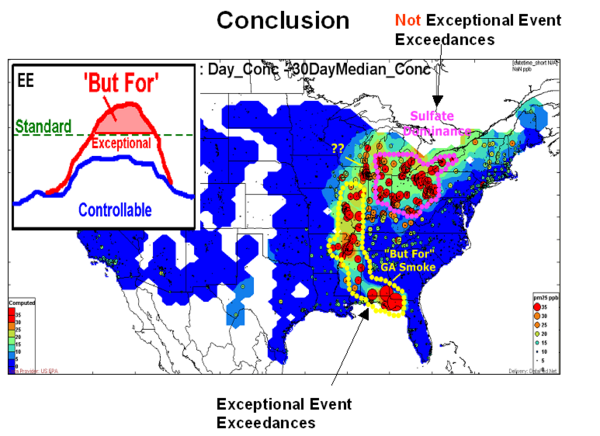
Conclusion: On May 24, the exceedances north of the Ohio River Valley were caused by the known anthropogenic sulfur emissions. This is deduced from the high sulfate concentration and airmass trajectories that have passed over the high emission regions. The region over which the exceedances were but for the presence of the exceptional Georgia Smoke is highlighted with yellow dots. The evidence arises primarily from (1) the high concentration of aerosol organics, (2) the backtrajectories to exceedeing sites passing over the known fire region (3) model simulation of sulfate and smoke and (4) numerous qualitative reports of smoke in the region. The level of sulfates was sufficiently low (< 10 ug/m3) and the level of organics was sufficiently high such that the violation would not have occurred but for the smoke organics.
Based on the combined chemical data and backtrajectories it is evident that the high PM concentrations that are observed along the western edge of the red trajectory path is due to the impact of the Georgia smoke. On the other hand the high PM2.5 concentrations just north of the Ohio River Valley are primarily due to known, controllable sulfate sources.
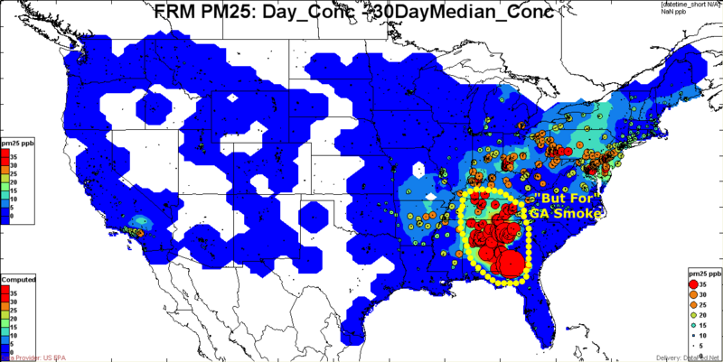
Conclusion: On May 27, the exceedances were clustered downwind of the GA smoke source. The multi-state region over parts of GA, AL, TN had low SO4 concentration (< 6 ug/m3), hogh OC concentration in excess of 10 ug/m3 and backtrajectories pointing toward the GA fires as the source of the organics. Thus, it is concluded that these exceedances over GA, AL, TN would not have occurred but for the impact of the GA smoke plume.
EE Data Presentation and Analysis Tools
Exceedance Detection and Screening Tool
The PM2.5 samples that are potential contributors to non-compliance can be determined visually and qualitatively by the PM2.5 Exceedance Screening Tool. The data browser tool has a map view and a time series view. The map view shows the PM2.5 concentration as colored circles for each station for a specific date. The time view shows the concentration time series for a selected site. The selection of time for the map view can be accomplished by entering the desired date in the date box or clicking the date in the time view. The selection of the station for the time series is accomplished either by choosing from the station list box or clicking on the station in the map view. (Note: Better description of generic DataFed browser needed). The coloring of the PM2.5 concentration values (circles) is adjusted such that the concentrations above 35ug/m3 are shown in red. This provides an easy and obvious (to everyone except Neil) way to identify the candidate samples for noncompliance.
A tool was developed for assessing "Excess PM2.5 Over the Normal". This is based on the calculation of the median concentration for each station for a wide time window (+/-15 days centered on any sampling day). The excess of the daily PM2.5 over the one month median is set to be the excess above normal.
Spatial Data Browser Consoles
Google Earth Browser for Event Data
Normal and Exceptional Pattern Analysis Tool
The pattern of air air pollution pattern varies in space, time and also depends on the pollutants. In case of PM, it also depends on the species in the PM chemical mix. The sulfate pattern, for example, is very different from nitrate, organics or dust. An event being exceptional, requires the it deviates from the "normal", but what is normal?
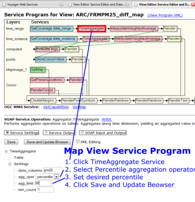
Excess PM25 concentration above 'normal' on May 24, 2008. In the images below, the 'normal' is defined as 50, 84 (+ sigma) and 95 Percentile of the distribution.
Time range 15 sYA,...2003- 2008
Data Views Used in this Analysis
<feed url="http://datafedwiki.wustl.edu/index.php?title=Data_Views_Catalog&action=feed&feed=rss" entries ="25">
- [{PERMALINK} {TITLE}]
</feed>
