Difference between revisions of "Visualization/Color"
| Line 4: | Line 4: | ||
What is an infographic and how to make one: | What is an infographic and how to make one: | ||
| − | *[http://mashable.com/2012/07/09/how-to-create-an-infographic/ | + | *[http://mashable.com/2012/07/09/how-to-create-an-infographic/ How to Create an Awesome Infographic] |
An online list of data visualization tools compiled by Interactive Things: | An online list of data visualization tools compiled by Interactive Things: | ||
| − | *[http://datavisualization.ch/tools/selected-tools/ | + | *[http://datavisualization.ch/tools/selected-tools/ selection.datavisualization.ch] |
Two simple to use mapping tools developed by NASA: | Two simple to use mapping tools developed by NASA: | ||
| − | *[http://www.giss.nasa.gov/tools/panoply/ | + | *[http://www.giss.nasa.gov/tools/panoply/ Panoply] |
| − | *[http://www.giss.nasa.gov/tools/gprojector/ | + | *[http://www.giss.nasa.gov/tools/gprojector/ G.Projector] |
A visualization framework developed by Periscopic: | A visualization framework developed by Periscopic: | ||
| − | *[http://www.stateofthesalmon.org/iucn/new/ | + | *[http://www.stateofthesalmon.org/iucn/new/ State of the Salmon] |
Examples of infographics: | Examples of infographics: | ||
| − | *[http://big.assets.huffingtonpost.com/A_Lonely_Planet_2_0.png | + | *[http://big.assets.huffingtonpost.com/A_Lonely_Planet_2_0.png A Lonely Planet] |
| − | *[http://xkcd.com/1071/ | + | *[http://xkcd.com/1071/ Planets to Scale] |
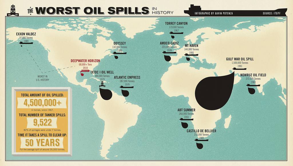
| − | *[ | + | *[http://blog.blueion.com/wp-content/uploads/2010/05/Infographic-The-Worst-Oil-Spills-In-History1.jpg Worst Oil Spills in History] |
Revision as of 14:04, July 10, 2012
Back to Visualization Cluster home
Infographics & Data Visualization
What is an infographic and how to make one:
An online list of data visualization tools compiled by Interactive Things:
Two simple to use mapping tools developed by NASA:
A visualization framework developed by Periscopic:
Examples of infographics:
Color
This is a nascent list of resources related to using color in visualizations. Many of these resources also include lists of references that are also very useful. If you have suggestions/additions to this list, please let me know.
The basics of color perception and how they relate to data visualization. Even though they are old, still very pertinent:
- Rogowitz, B.E.; Treinish, L.A., (1998, December). Data visualization: the end of the rainbow. Spectrum, IEEE , 35, 12, 52-59.
- Rogowitz, B.E.; Treinish, L.A., (1995). How NOT to Lie with Visualization.
How non-experts view data visualization:
- Phipps, M., Rowe, S. (2010, May). Seeing satellite data. Public Understanding of Science, 19, 3, 311-321.
Describes different color tables for sequential, diverging, and qualitative data, along with a selection of appropriate palettes:
- Brewer, Cynthia. (2010). Color Brewer.
- Wijffelaars, M., Vliegen, R., Van Wijk, J. J. and Van Der Linden, E.-J. (2008), Generating Color Palettes using Intuitive Parameters. Computer Graphics Forum, 27: 743–750. [full text]
Other resources
- Borland, D., Taylor, R.M., (2007). Rainbow Color Map (Still) Considered Harmful. IEEE Computer Graphics and Applications, 27, 2, 14-17.
- Using Color in Information Display Graphics
- A rainbow for everyone (How color ranges are seen by users with color vision deficiencies)